Week 2
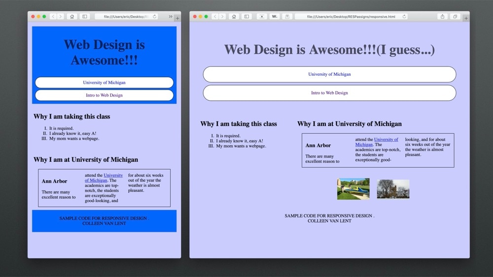
This assignment was to change the style sheet of an existing page to create reponsive elements.
This is the fourth course in the Web Design For Everybody specialization. With the increased use of smartphones to access the Internet, people viewing your site expect that it will perform regardless of the platform (smartphone, tablet, laptop, or desktop computer). This feature of responding to any platform is responsive design. This course will expand upon the basic knowledge of CSS3 including topics such as wireframes, fluid design, media queries, and the use of existing styling paradigms such as Bootstrap. The course teaches the mobile-first paradigm and the importance of wireframes in the design phase. Creating sites that behave across a range of platforms and can utilize existing design frameworks such as Bootstrap is a focus.
This assignment was to change the style sheet of an existing page to create reponsive elements.
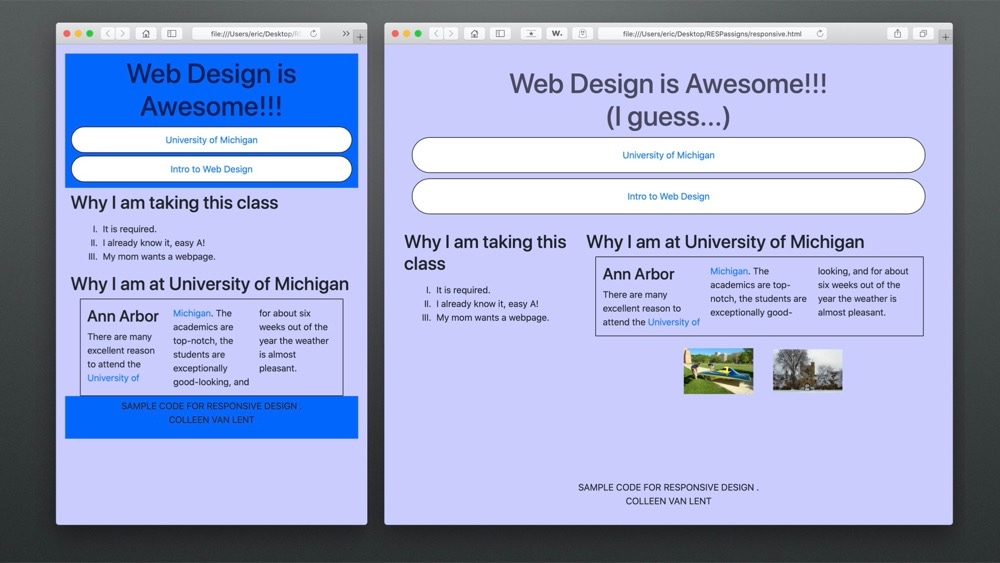
This assignment was to use Bootstrap to create the styling for the responsive site.
This project was to create your own responsive site.
<!DOCTYPE html>
<html lang="en">
<head>
<title>Responsive Design Photo Gallery</title>
<link rel="stylesheet" type="text/css" href="css/PhotoGallery.css"/>
<meta charset = "UTF-8">
</head>
<header>
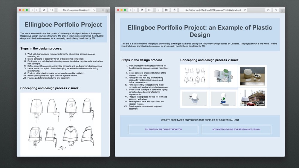
<h1>Ellingboe Portfolio Project</h1>
<p>This site is a creation for the final project of University of Michigan's Advance Styling with Responsive Design course on Coursera. The project shown is one where I led the industrial design and plastics development for an air quality monitor being developed by TSI.</p>
</header>
<section id = "left">
<h2>Steps in the design process:</h2>
<ol>
<li>Work with team defining requirements for the electronics, sensors, access, mounting, etc.</li>
<li>Ideate concepts of assembly for all of the required componets.</li>
<li>Participate in a half day brainstorming session to validate requirements, and define new concepts.</li>
<li>Refine assembly concepts using initial concepts and feedback from brainstorming.</li>
<li>Ideate visual concepts to determine styling seriection based on manufacturing requirements.</li>
<li>Produce initial plastic models for form and assembly validation.</li>
<li>Refine plastic parts with input from the injection molder.</li>
<li>Finalize parts for manufacturing and assembly.</li>
</ol>
</section>
<section id = "center">
<h2>Concepting and design process visuals:</h2>
<div>
<a href="https://i.postimg.cc/vBMrQHky/Ideation.png" >
<img src="https://i.postimg.cc/vBMrQHky/Ideation.png" alt="Air sensor ideation sketch page.">
</a>
<a href="https://i.postimg.cc/jjy60J8v/Concept-Explode.png" >
<img src="https://i.postimg.cc/jjy60J8v/Concept-Explode.png" alt="Air sensor exploded view hand render.">
</a>
<a href="https://i.postimg.cc/MHp1Q3zr/Prototype.jpg" >
<img src="https://i.postimg.cc/MHp1Q3zr/Prototype.jpg" alt="Air sensor 3d printed prototype.">
</a>
<a href="https://i.postimg.cc/t4KdMzzY/3dRender.png" >
<img src="https://i.postimg.cc/t4KdMzzY/3dRender.png" alt="Air sensor 3d rendering.">
</a>
<a href="https://i.postimg.cc/vZgLhKfJ/3d-Render-Explode.png" alt="Air sensor 3d rendering exploded view.">
<img src="https://i.postimg.cc/vZgLhKfJ/3d-Render-Explode.png" alt="Air sensor 3d rendering exploded view.">
</a>
<a href="https://tsi.com/getmedia/fec4b02e-6924-44b6-bdd3-3a20ba64be94/BlueSky-monitor-chinatown-515px?width=515&height=343&ext=.jpg">
<img src="https://tsi.com/getmedia/fec4b02e-6924-44b6-bdd3-3a20ba64be94/BlueSky-monitor-chinatown-515px?width=515&height=343&ext=.jpg" alt="Air sensor product in use.">
</a>
</div>
</section>
<footer>
<p>Website code based on project code supplied by Colleen van Lent</p>
<nav>
<a href="https://tsi.com/focus/bluesky-air-quality-monitors/">TSI BlueSky Air Quality Monitor</a>
<a href="https://www.coursera.org/learn/responsivedesign">Advanced Styling for Responsive Design</a>
</nav>
</footer>
</body>
</html>
body{
	margin: 1%;
	padding:1%;
	background-color: rgba(200,219,239,.5);
	font-size: 100%;
	min-width: 320px;
	font-family: Arial, Helvetica, sans-serif;
}

header, footer{
  background-color:rgba(200,219,239,1);
  padding: 1%;
  margin: 1%;
}

header h1{
	font-size: 3rem;
	color:rgba(0,0,0,.7);;
}

section{
  margin:1%;
    padding:1%;
}

nav a{
	display:block;
	background-color: rgba(200,219,239,1);
	border: 1px solid black;
	text-align: center;
	border-radius: 5px;
	text-decoration: none;
	padding: 2%;
	margin: 1%;
}

h1{
	text-align: center;
	color:rgba(255,0,0,.7);
}

ol{
	list-style:upper-roman;
	margin:1em;
}

div{
	align-content: center;
}

img{
	display: inline-block;
    margin: 0px;
    width: 90%;
    padding: 2%;
    background-color: white;
}

footer{
	clear: both;
	text-align:center;
	text-transform: uppercase;
}

@media screen and (min-width:768px){

  header h1::after{
    content: ": an Example of Plastic Design"
  }
  #left {
    width: 40%;
    float: left;
    display: inline-block;
  }
  #center {
    width: 50%;
    float: right;
    display: inline-block;
  }
}

@media screen and (min-width:992px){

  #left {
    width: 30%;
    float: left;
    display: inline-block;
  }
  #center {
    width: 60%;
    float: right;
    display: inline-block;
  }
  img{
    width: 45%;
  }
  nav a{
	display:inline-block;
	width: 40%;
}

@media screen and (min-width:1200px){

  #left {
    width: 30%;
    float: left;
    display: inline-block;
  }
  #center {
    width: 60%;
    float: right;
    display: inline-block;
  }
  img{
    width: 25%;
  }
}

@media print {

  body{
	background-color: white;
  }
  header, footer{
    background-color: white;
  }
 header  h1{
    font-size: 2em;
  }
  nav a{
	display:block;
	background-color: white;
	border: 0px;
	text-align: center;
	border-radius: 0px;
	text-decoration: underline;
	padding: 0%;
	margin: 0%;
  }
  img{
    width: 28%;
  }
}
My grade for this courseIntroduction to CSS3is: